Strategic thinking in product planning helps define the boundaries of decision-making, but strategy alone is not enough. Once the strategic direction is clear, the work has to move into design. At that stage, the discussion becomes more concrete: product functions need to be defined in detail, and the quality of the experience becomes part of the design task itself.
Product planning at the design level follows a user-centered approach. The guiding principle is user experience, with product functions and interactions shaped around real user needs. In practice, this way of thinking can be organized into four priorities, forming a pyramid-like model.
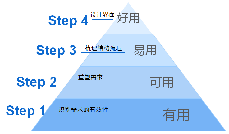
1. Useful: validate the need and identify the core demand
For a new product, the first and most important question is whether it is actually useful to the people it is meant to serve. "Useful" is the direction that must be clarified before definition and development begin. It requires a clear functional definition and a clear user definition.
A refrigerator is a simple example. Its core purpose is preservation and freezing, and its users are the people who need those functions. A refrigerator may look stylish and include extra features, but if it fails to preserve food properly or freeze reliably, it is still a failed product. The reason is straightforward: its core value is not useful to its intended users.
This is the starting point for product planning. Before discussing refinement, expansion, or visual polish, the product must first solve a real problem in a meaningful way.
2. Usable: make the product reliable across different situations
Once the product direction is clear, the next requirement is that it must be usable. Usability at this level is the baseline standard that protects the product from failing in practice. It means avoiding functional bugs and ensuring acceptable performance in areas such as safety, speed, compatibility, and smooth operation.
An online banking website illustrates this well. Its core function is online banking, so it may satisfy the condition of being useful. But if it performs poorly in actual use, it fails on usability. A typical example is a banking site that only supports Internet Explorer. In that case, users in non-IE environments are effectively blocked from using the service at all.
A product cannot be considered successful simply because its purpose makes sense. If people cannot access it reliably, use it safely, or complete key tasks without technical obstacles, then its value remains unrealized.
3. Easy to use: simplify structure and reduce the cost of use
Only after a product is both useful and usable does it make sense to focus more deeply on whether it is easy to use and enjoyable to use. These two layers involve many finer details and require careful study.
The principle of being easy to use is closely tied to user experience. Product design should take user habits and usage scenarios seriously, and it should reduce both the learning cost and the operational cost of using the product.
A good example can be seen in email products such as QQ Mail and NetEase Mail. When users want to bulk-delete messages by day or by week, QQ Mail allows the task to be completed in just two steps, while NetEase Mail requires many more. That small detail reveals a major difference in user experience: NetEase increases the user's effort without adding value.
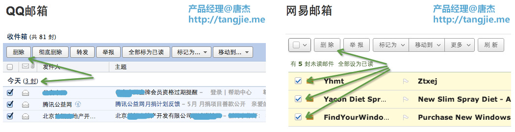
Today, spam and meaningless subscription emails are increasingly common. After an email account has been used for a long time, users often receive messages every day that need to be deleted. Because of that, deletion is not a minor feature for email users; it is an important one. In this respect, QQ Mail clearly outperforms NetEase Mail in ease of use.
Ease of use is often revealed in these ordinary, repetitive actions. The more frequently a task occurs, the more important it becomes to make that task simple and efficient.
4. Pleasant to use: refine the interface to match user preferences
After the first three conditions have been met, product design can place more emphasis on visual expression as part of the user experience. At this level, interface design is not just about appearance. It should guide behavior, trigger intuitive actions, and reduce the amount of conscious thought required from the user.
The highest level of UI design is improved operating efficiency. Color, graphics, and visual hierarchy can shape user habits and make the relative importance of functions or content immediately clear. When the interface is designed well, users should understand what to do without having to stop and think. That kind of visual communication is itself a language.
This final layer is not a substitute for the earlier ones. A beautiful interface cannot compensate for a product that is not useful, unreliable, or cumbersome. Visual refinement matters most after the fundamentals are already solid.
A practical order for product design priorities
These four design principles provide a clear way to identify functional definitions and user definitions, while also helping set the priority of requirements. In the course of product development, the first task is to ensure that the core function is completed and that the product is both useful and usable to its target users. From there, rapid iteration can improve the product further, gradually optimizing ease of use and overall interface quality.