Flexbox, short for flexible box, is a layout model introduced in CSS3. It controls how elements are arranged on a page so they can behave more predictably across different screen sizes and devices.
It is called Flexbox because items inside a flex container can expand or shrink to make the best use of available space. Compared with older layout approaches such as table-based layouts, floats, or inline-block combinations, Flexbox offers much stronger control. It makes it easier to:
- lay out elements in different directions
- change the visual order of elements
- control alignment
- distribute items dynamically inside a container
Basic ideas behind Flexbox
Any element using Flex layout becomes a flex container. Its direct children automatically become flex items.
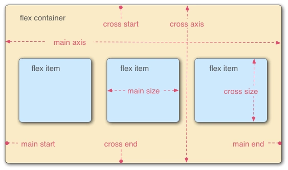
The model revolves around three core concepts:
- flex items: the elements being laid out
- flex container: the parent that holds those items
- direction: the axis along which items are placed
Flexbox vs. Grid
Flexbox is an axis-based layout system. You mainly control how items are positioned along a single axis, so it is usually treated as a one-dimensional layout.
Grid divides a container into rows and columns, creating cells that items can be placed into. For that reason, Grid is considered a two-dimensional layout.
Properties of the flex container
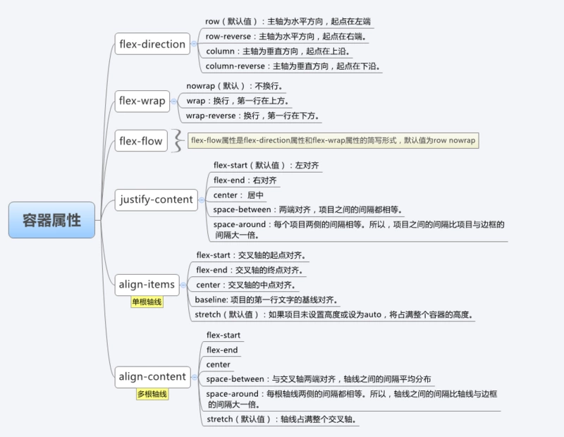
flex-direction
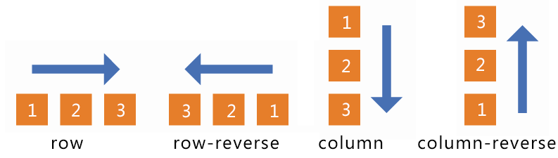
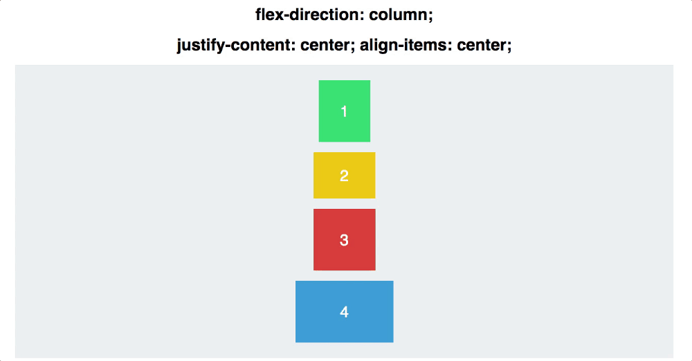
This property defines the main axis.
row(default): the main axis is horizontal, starting from the leftrow-reverse: the main axis is horizontal, starting from the rightcolumn: the main axis is vertical, starting from the topcolumn-reverse: the main axis is vertical, starting from the bottom
flex-wrap
This controls whether items stay on one line or move onto multiple lines.
nowrap(default): no wrappingwrap: items wrap, with the first line at the topwrap-reverse: items wrap, with the first line at the bottom
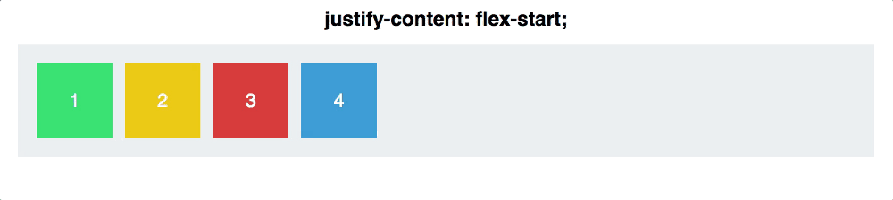
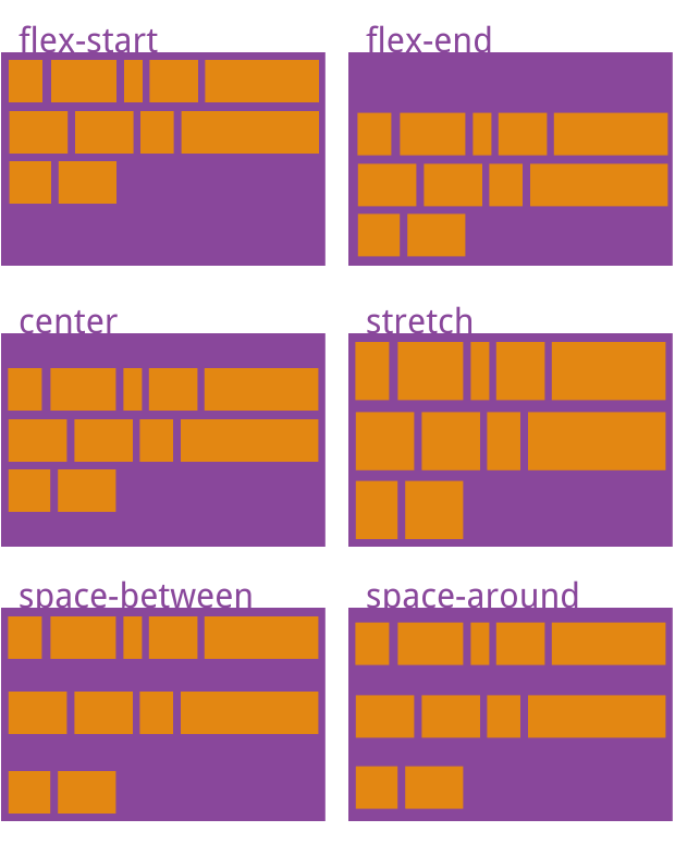
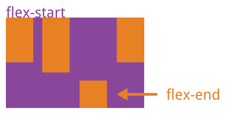
justify-content
This controls how items are distributed along the main axis.
flex-start(default): align to the startflex-end: align to the endcenter: center the itemsspace-between: first and last items touch the ends, and the spacing between items is equalspace-around: each item has equal space on both sides, so the gaps between items are twice the gaps at the edgesspace-evenly: all visible spaces are equal, including the space at both sides of every item
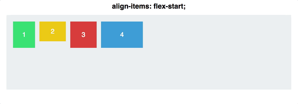
align-items
This controls how items align along the cross axis.
flex-start: align to the start of the cross axisflex-end: align to the end of the cross axiscenter: align to the middle of the cross axisbaseline: align according to the baseline of the first line of textstretch(default): if an item has no set height, or its height isauto, it stretches to fill the container’s height
align-content
This property controls the alignment of multiple lines along the cross axis. If there is only a single line of flex items, this property has no effect.
flex-start: lines align to the start of the cross axisflex-end: lines align to the end of the cross axiscenter: lines align to the middle of the cross axisspace-between: first and last lines align to the edges, with equal spacing between linesspace-around: each line has equal space on both sides, so the gap between lines is twice the gap between the outer lines and the container edgestretch(default): lines stretch to fill the full cross axis
When justify-content and align-items are viewed together, the effect changes depending on the value of flex-direction, because the main axis and cross axis switch directions.
Properties of flex items
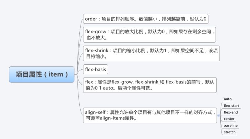
order
The order property changes the display order of flex items.
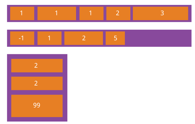
flex-grow
flex-grow defines how much a flex item can grow when there is extra space. Its default value is 0, which means the item does not grow even if unused space exists.
If every item has flex-grow: 1, the remaining space is divided equally among them. If one item has flex-grow: 2 and the others are 1, that item receives twice as much of the leftover space as each of the others.
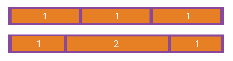
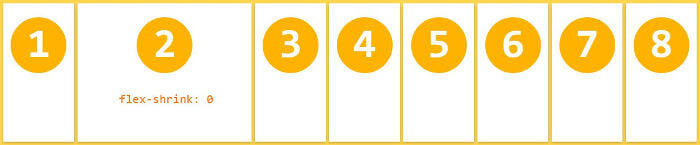
flex-shrink
flex-shrink defines how much a flex item can shrink when space is insufficient. Its default value is 1, meaning the item is allowed to shrink.
.item {
  flex-shrink: <number>; /* default 1 */
}
If all items use flex-shrink: 1, they shrink proportionally when the container does not have enough space. If one item uses flex-shrink: 0 while the others are 1, that item will not shrink when space runs short.
Negative values do not work for this property.
align-self
align-self lets one specific item use a different cross-axis alignment from the rest. It overrides the container’s align-items value. The default is auto, which means it follows the parent’s align-items; if there is no parent setting, it behaves like stretch.
.item {
  align-self: auto | flex-start | flex-end | center | baseline | stretch;
}
One detail that often surprises people is that Flexbox does not change an item’s width by default, but it does affect height by default. If an item does not have an explicit height, it will stretch to occupy the full height of the container.